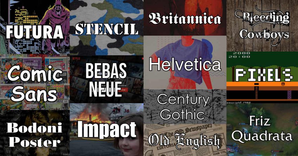
12 Iconic Typefaces in Pop Culture

The funniest thing about logos is that it is a well-recognized format, and most of the most creative ones are derivatives of commonly used typefaces in design. This study is how Logos correlate with how the human mind struggles with the thin line of self-identity and innovation all for branding their business.

Futura

There are pretty many notable users of this fort. The most recognizable to me was the work of Alan Moore of DC comics and Nike. Alan Moore used it first in the first Watchmen in 1986, then in V for Vendetta. Another unique logo that used Futura is the Just Do it Campaign for Nike. The movie They Live, also stars the iconic professional wrestler Roddy Piper, where their logo inspired streetwear companies Supreme and Obey. There were other popular usages of the Futura like Avon, Best Buy, and Calvin Klein.

Comic Sans

There has been a stigma that no one on the Internet and in the professional world took comic sans seriously because it looked silly. However, in the pop culture world, Manga and Comics were a big deal. Nowadays, the top-grossing films are comic book films from Marvel and DC, and every anime you are familiar with mostly came from a Manga series. The standard font for comics and manga is proof that the classics have never run out of style since the 40s.

Bodoni Poster

The Nirvana logo, which was notoriously tributed and parodied, was first used in their 1989 debut record Bleach. The main idea from this logo was If it’s not wrong, don’t fix it. Thousands of brands and musicians paid tribute to this logo, and it showed that everything that shaped Nirvana was gold.

Stencil font

The stencil font is as standard as bread. It was commonly seen in military and Naval camps, but a small Californian rock band in the late 90s called Linkin Park made it relevant. Their whole style came from street art, mainly inspired by the anonymous graffiti artist named Banksy.

Century Gothic

If anything is a certainty, Nothing can make you look as professional as a minimalistic typeface. The Jobhunting and professional social media platforms LinkedIn, Fox, Ellen Degeneres, FedEx, Durex, and Weezer are famous examples. Maybe there was a Harvard student on the marketing team? Oh, wait. Rivers Cuomo of Weezer was from Harvard. Graphique/Bebas Neue Netflix had a unique design in the late 90s. It was called Graphique and was developed by Haas Schriftgießerei originally in 1945. They minimized the typeface in 2014. Ralph Ünger made the updated and Digitized logo called Bebas Neue.

Impact

Legend has it that there is no good meme if it wasn’t made using Impact. Well, that is not entirely the case, but this meme is iconic for every meme you saw in the early 21st Century.

Bleeding Cowboys

This one is an inside joke for every person who went to rock shows in the early ’00s to late ’10s. This logo is for your sad, manipulative boyfriend’s whiny emo band. Unfortunately, it was too familiar for local rock bands worldwide to use it so much that it became noticeable.

I don’t know about your boyfriend. He might drink more monster energy drinks than water. Send help.

The Pixel Font

This one is nostalgic that when Soccer Mommy released her record, Color Theory in 2019, it was hyped. This logo will instantly remind any video game or anime fan of Street Fighter, every 8bit Atari game, and Digimon.

Engraver's Old English

The Old English font created notoriety for every edgy rock band out there. Since the 80s, Bands like Bathory, Black Sabbath, At The Gates, Burzum, Dead Kennedys. This font was the go-to logo if you’re brutal and dark.

It had the reputation of being so rebellious that Taylor Swift used it for her logo in her record entitled, well… uhmmmm… Reputation.

Helvetica

This typeface is everyone’s go-to matured corporate logo. Huge companies like Microsoft, Epson, CBS, and LG, adapted this logo. I don’t know, billionaire logo. Big money. Swag.

It had set the standard for corporate reputation and even brands like Uniqlo, Gap, and Abercrombie and Fitch use it in their T-shirt designs a lot.

Friz Quadrata

Fritz Quadrata is commonly used on movie trailers and magazines. It is also of the iconic men’s magazine Playboy. Its notoriety in pop culture has been recognized, all thanks to Raymond Pettibon, who religiously used it in his artwork in his former band, Black Flag.

It was also notoriously used in the streetwear brand Anti-Social Social Club, the band Bad Religion, and the movie American History X.

Britannica

Britannica is one of my personal favorites because it was used in my favorite game, Castlevania. It was also used by the iconic skateboarder Stacy Peralta of The Bones Brigade, where he discovered who would be the best skateboarder on the planet, Tony Hawk.

Coca-Cola took the opportunity of the cultural relevance of this typeface in their Mother Energy Drink brand. Lastly, the shonen anime Black Clover uses it in its logo.

Leave a Comment

Shares